
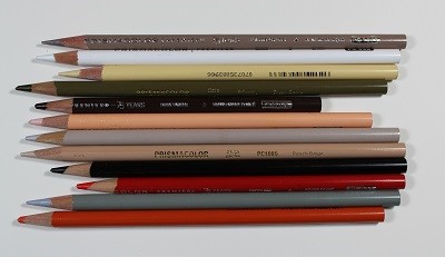
Sometimes it is fun to experiment in colors that are not my typical choices. I noticed that the colors I used to create my Red-bellied Woodpecker yesterday were both warm and cool:
So I decided to use similar colors when painting papers with acrylics for later in collage.
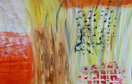
Here are some of my painting results:
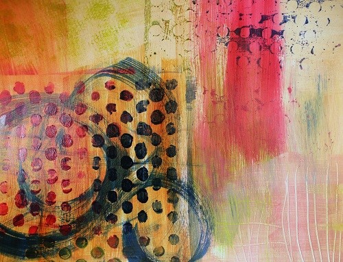
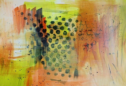
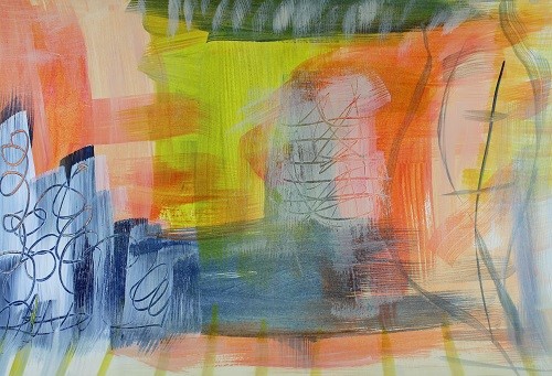
I like how they turned out, how about you?
I challenge you to create in colors that aren’t your “go to” colors. The results may surprise you!
Happy Painting! 🙂

Warm and cool looks great around here. They are awesome!
LikeLiked by 1 person
Thanks Catherine, I had fun! 😃
LikeLike
fun and beautiful abstracts! love them!
LikeLiked by 2 people
Fun to play with different color combos! 🎨😃
LikeLike
These are beautiful!! Love these combos of color Jill! And I really like the composition on the second one with the large pop of yellow. Very nice! 😃💕
LikeLiked by 2 people
Thanks Charlie! I don’t paint much with cool greys – how about you? 🎨❤️
LikeLiked by 1 person
I’m sort of all over the place! Hehe…sometimes cool, sometimes warm…just depends on what the subject seems to want. 😊
LikeLiked by 1 person
Beautiful work.
LikeLiked by 2 people
Thank you so much! 😄
LikeLike
Nice work, Jill! Love those colors and textures, you really have a great sense!
LikeLiked by 2 people
It was fun to experiment with colors I don’t normally use. Do you have certain colors you tend to use in your paintings, Laura? 🎨😃💖
LikeLiked by 1 person
You know, I’ve never really thought about it, Jill. I guess blues and greens are my go-to colors, but I’m a lot like you. I like all kinds of colors and the more the better! Purple is one of my favorite colors, but it hardly ever winds up in my paintings. Do you have favorite colors that you actually don’t use much in your artwork?
LikeLiked by 2 people
I don’t use much peach which is really just a lighter shade of orange. I guess I tend to gravitate towards the brighter colors. I found that I like Payne’s Gray but I don’t often use it mixed with cream. It makes a lovely shade of gray. 😄
LikeLiked by 1 person
Jill, your Experiment With Color is magnificent! love the balance. the ratios. the harmony. there is light and dark. complementaries. layers and overlapping. But yet, you stopped. Before it all went Too Far! Perfect 🙂
LikeLiked by 2 people
Wow, Debi! Thank you for your nice comments! You made my day! 💖🎨💕
LikeLiked by 1 person
my pleasure Jill!
LikeLiked by 1 person
Wonderful experimenting Jill. You are thinking out of the art box! 😍🎨
LikeLiked by 2 people
Thanks Sharon! 😃 I hope to get some Towbow markers and blender from Dick Blick this week so I can try your ribbons! ❤️🎨
LikeLiked by 1 person
Cool, good luck and have fun!
LikeLiked by 1 person
They’re cool, fun and spectacular. xo
LikeLike
I absolutely love these! One of my fave color combos is the blue and oranges and peaches.
LikeLiked by 1 person
Thanks Suz! I haven’t used peach much because I tend to use mainly bright colors. Kind of fun to change things up a bit. 🎨😄
LikeLiked by 1 person