
Sometimes I make art for classes that are just for practice but I dislike wasting good art paper.
Yesterday, I decided to add pattern and color to two of such papers.
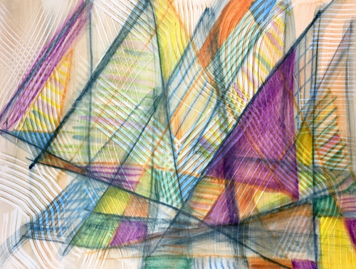
My first experiment were repetitive triangle shapes on 90 lb hot press paper. I added more pattern and color with water soluble crayons and then softened them with water:


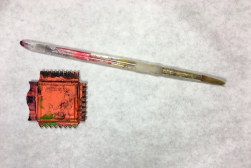
Next, I mixed a tiny bit of transparent orange acrylic paint with matte medium and brushed it onto my paper. I added more pattern on top with a plastic tool by Plaid.
My second experiment was adding to shapes I had done with sumi ink and water soluble crayons to create a feeling of rhythm. I added additional pattern and color similar to my first experiment.


I mixed a tiny bit of transparent red with matte medium but got a little too much red so I softened it with more matte medium for the second half on the left.
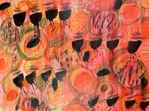
I used the end of my acrylic brush to make marks into the wet paint on this one.
Orignally, I was going to use both papers for collage material but I’m not sure I will cut up the first one! I like it too much. It reminds me of sailboats and summer.
I encourage you to experiment with pattern and color play over some artwork you’d like to repurpose. You may surprise yourself!
Cheers! 🙂

I love that first one….it feels like a stream of sailboats. 🙂
LikeLiked by 1 person
Thank you Kathy, I was thinking the same thing! I like how the matte medium created texture and a feeling of movement. ⛵️
LikeLike
Wow. These are great. Don’t blame you for not wanting to cut it up
LikeLiked by 1 person
Thank you Roshanda, I want to make more of these papers now! 😍
LikeLike
Your patterns turned out fabulous!
LikeLiked by 1 person
Hi Sharon, I can’t wait to make more papers today! 💗🎨
LikeLiked by 1 person
Wonderful and playful. I need to clean off my art table so I can get back to work.
LikeLiked by 1 person
Hi Carol, I agree! 😃 I need to clean mine too. I did the mark making in the composition class with Anita Lehmann. Are you taking this class?
LikeLiked by 1 person
Yes I am and I haven’t started yet.
LikeLiked by 1 person
Love the additions.
LikeLiked by 1 person
Thanks Susan! 😍 Fun to play! ⛵️🌼🌈💕
LikeLiked by 1 person
Always 💞😊
LikeLiked by 1 person
They look so neat! I like the black champaign glasses and the lovely sails in the colors of the sea.
LikeLiked by 1 person
Hi Deborah, the black marks do look like champagne or martini glasses! 🥂 I was making the marks to music. I like the sailboat one the best. I like that it has a feeling of movement. ⛵️💕🌈
LikeLiked by 1 person
The sailboat one is stunning, kinda gauzy and dreamy 🙂
LikeLiked by 1 person
Thank you Liz, I agree, it does look dreamy! 😊 I hope to do more of these with the matte medium. ⛵️💕
LikeLiked by 1 person
Love the sailboats!! I can feel the movement. The colors and patterns are amazing!! 💙💜❤️⛵️😀
LikeLiked by 1 person
Thanks Patty Anne, I like when these happy accidents happen in art! ⛵️🎨
LikeLiked by 1 person
You really got some cool effects, and I do love the triangles! The square you cut out looks like an exotic postage stamp!
Jenna
LikeLiked by 1 person
Thank you Jenna, the texture turned out amazing. I didn’t think of a postage stamp, I like your description! 😊🎨⛵️ Have you ever been sailing?
LikeLike
Yes! we used to have a sailboat!
LikeLiked by 1 person
These are awesome, Jill! 😍 Adore the first pattern that almost looks like sails… it’s mesmerizing… I can’t stop staring at it!!
LikeLiked by 1 person
Thanks so much Charlie, I love how it turned out too – a happy accident! 😁⛵️
LikeLiked by 1 person
I love those layered lines. (K)
LikeLike